I've been feeling quite overwhelmed by the work load the past week or so, i think that for some reason this has meant that i haven't been able to get work done as easily. I seem to be worrying about doing the work more than actually producing anything. However i have managed to start producing things and ideas of a standard I'm happy with. I've have been to B&Q tonight and bought what i need to produce the artwork for either the cover or the article, i haven't decided which it would best on yet. Once i have actually made it i will find it easier to decide.
I have also began to set out the article, i am slightly worried that it isn't going to be designee enough but i am going to try and incorporate how the 3d revolution could effect designers, advertising being one example. I was considering changing the article to be about a designer/artist james told me about called javier mariscal who's work is quite stylized but he uses 3d graphics/sculpture quite a lot. This would have been a different type of 3d design, that would fit the theme i've decided on. i think i will have this article on the contents page so that i can maybe add it to my portfolio at some point. i've added a couple of examples of his work.
I might look at other types of 3d design as well like architecture and product design for the other parts of my contents. but now im going to start wrting the article because it will be easier once its started.


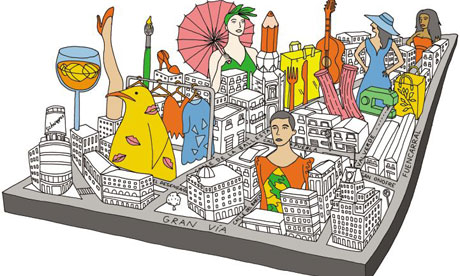


 really like this
 .
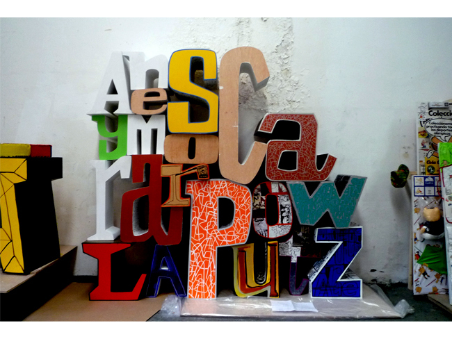
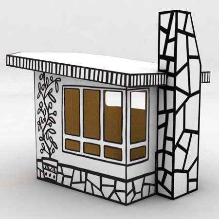
. This is really good as well


