Search This Blog
Wednesday, 29 September 2010
Ron English
POPAGANDA
One of the most prolific and recognizable artists alive today, Ron English has bombed the global landscape with unforgettable images, on the street, in museums, in movies, books and television. English coined the term POPaganda to describe his signature mash-up of high and low cultural touchstones, from superhero mythology to totems of art history, populated with his vast and constantly growing arsenal of original characters, including MC Supersized, the obese fast-food mascot featured in the hit movie “Supersize Me,” and Abraham Obama, the fusion of America’s 16th and 44th Presidents, an image widely discussed in the media as directly impacting the 2008 election. Other characters carousing through English’s art, in paintings, billboards, and sculpture include three-eyed rabbits, udderly delicious cowgirls and grinning skulls, blending stunning visuals with the bitingly humorous undertones of America’s Premier Pop Iconoclast.
http://www.popaganda.com/blog1.php
Tuesday, 28 September 2010
anthony burrill at brussels design forum
http://www.designboom.com/weblog/cat/8/view/11657/anthony-burrill-at-brussels-design-forum.html
Monday, 27 September 2010
Had the first lesson with the rest of level 3 today, made me realize i need to sort my portfolio out pretty sharpish. Also to maybe think about the format that i present my work.
Printers that are good: http://www.espritimaging.co.uk/
I also really need to sort out a website, preferably before thursday. I don't want to use the website i designed last year because it is shit. I didn't really realize the concept very well.
Today also kind os scared me with regards to the final project, especially due to how i coped last year at coming up with my own brief.
Thursday, 23 September 2010
3x3
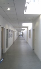
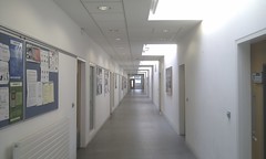
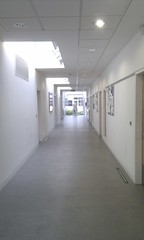
We have decided to base our project in a corridor, in the epicenter. I think this will give us enough scope to experiment with different aspects of the area, for example: the perspective looking down the corridor makes an interesting image. The colours represented in the area are quite interesting. the different light sources are interesting. the art work there could bring something to the project. quite a lot of people pass through that area so sound capturing may produce some interesting conversations. the use of the surrounding rooms could bring an twist to the project.
Wednesday, 15 September 2010
I guess its about time to start blogging again before starting uni again next week. Probably should of kept it up over the summer but theirs not much i can do about that now. Im not sure if im going to get away with just using this blog as my online presence. Probably not so i'll have to throw something together, but i cant remember the domain name i bought. Im a bit nervous about going to uwe because they're going to expect a lot more from us that at filton. I should be alright as long as i keep my head down but that isn't really my strong point. Im excited about the challenge though its sort of make of break this year for me and right now i think im going to smash it! Im going to go and figure out exactly what i need to have ready before next week now. hopefully not that much.
Thursday, 20 May 2010
I am trying to get as much done today as possible in the hope of handing in tomorrow, however i am not sure i will be able to get everything done in time. I've printed all of my research and development work but have still got to sort it and put it into folders and flip files. I cant wait to have this finished.
Tuesday, 18 May 2010
i've written the majority of my evaluation, work experience, and some of the 5 designers which i wasn't going to do because i have researched loads but the file became corrupted. I started to design the flyer handout of my work for the exhibition today but i will do more work on that tomorrow. Tomorrow I'm going to put the final touches on my website and print it off ready for hand in. also Im going to cut out my posters and put them in my portfolio ready for friday. i still have to print all my development work and research and put it into folders. I need to put my bibliography together as well. blaahhh blahh bblahh
I managed to get my posters printed yesterday and they look better than i expected. There are some little tweaks to sort that are more visible now that they are full scale but they wont take long. Also I don't like the paper i used, I think a glossy paper would word better but that might involve coat the posters after printing and that might cost quite a bit. Im going to design a boklet to hand out for the exhibition, but i am going to concentrate on getting the written work done today.
My computer crashed yesterday and i lost half of my research so i need to quickly gather that again i guess. The folder says that its corrupted and has an error code 5??? So annoying because i cant remember exactly where i got everything from and exactly what i had. Oh well.
Monday, 17 May 2010
monday
I was supposed to be printing my posters this morning but haven't been able to get them to a suitable level over the weekend. I still have to design a new symbol for the pattern poster and finish it. I also have to finish the alan fletcher poster by deciding on which effect to use and whether it looks cheap or not. I have to add a with thanks comment to each. then i need to print them as thumbnails to make sure the colours are alright. I have to source the right paper also.
so to sum up:
-symbol
-fil in pattern
-pick the fletcher
-add with thanks
-check colour
-source paper
Friday, 14 May 2010
I've spoken to james about the final designs and he's given me feedback about them. I've changed the symbols one to a square and made it bigger so that the type is more legible. I have changed the typography at the bottom of each poster so that the kerning and leading is more aestheticly pleasing. I have also been experiment ing with the alan fletcher design to try and make the effect of the water more obvious. however i am not sure whether i like it or not as it just looks like a cheap photoshop effect rather that a real image. i also experimented with a brush effect over the top of the type rather than the water which is quite effective but has the same problem as before.
The most recent poster of a cross section of the skin is a little bit crude as some of the elements don't line up and i don't know how to make it better without a lot of time consuming trial and error work.
The poster do seem to be coming together now though which is a relief, the final outcomes aren't of as high a quality as i would have hoped but i have definitely learnt the necessity of practicing time management processes like a diary.
Thursday, 13 May 2010
I feel that i have pretty much finished 5 posters now and have one left to do. I have been collecting loads of visual research for it and it has been helping. I think i am going to try and come up with something in a milton glaser/saul bass/paul rand/robert brownjohn. so basically no idea... or 50's witty design
Saturday, 8 May 2010
I had a really productive day yesterday and managed to get some more good ideas with a bit of help from james. I have a time booked on monday for the studio so i can take some pictures for another poster which will fit wit my alan fletcher idea, using the quote 'the person you love is 72.3% water'. i am going to print that quote out and place it under some glass and pour water on it. then hopefully the water will distort part of the text but you will still be able to read what it says. that will give me 5 posters.
i still have to sort my research into a coherent form for hand in. i might try and make a booklet as well containing mu posters that would serve as a bit of marketing.
Wednesday, 5 May 2010
today got off to a bit of a rubbish start as i went to bower ashton for an induction a day early. however i still managed to make it to oli's lesson only 10 mins late and whilsti was at uwe i saw a sries of poster that inspired me. they represented different organs but consisted of inannitmate objects unrelated to organs in every sense except weight. i wold like to do something abstract like this for the alan fletcher poster because im supposed to be thinking like him not copying him, i've begun doing thing in a way that i'm normally good at avoiding which is doing things litterally rather than laterally. lateral witty thinking is for me what alan fletchers design is all about so i am going to try and design something now which includes a quote and some sort of imagery that represents anatomy and/or design.
HELP...
Tuesday, 4 May 2010
Tuesday, 27 April 2010
have resized and printed the bloodbag sticker but i think i need to print it on something different to get the right effect. I have also been out taking pictures for the website but didnt reall et any good ones because i was on my own and felt like a bit of a berk. will go back ot in a bit with a friend to help.
i need to set up a legal and copyright document for this project and get started on it.
Monday, 26 April 2010
update
I have drawn up a daily timetable which i think will really help, and am on target for today.
I have started to experiment with the underground map design,and have realized that i'm not very good at using a scalpel. however its nice to get away from the computer. I think i might try and use the plotter to cut out a load of vinyl strips that would be the different lines. this would be more time efficient and would produce a cleaner finish. also it would make the idea more viable if it where to be a real design.
I am going to experiment with having the stop circle in the middle and have the tube lines in the right colours on the left going in and as they come out turning into ckny cut and going to the design museum.
Time management to do list:
Outline the designers i have looked at
collate some of the research into something i can hand in
Finish the Blood bag image
finish the maximalism poster
experiment with the underground poster
collect some scrap images for the alan fletcher quote poster
sort out the type for de stijl poster
Design the symbols
website stuff
take a couple of extra pictures of myself firstly
Saturday, 24 April 2010
update
i am actually really struggling now. i don't seem to be able to concentrate and have to a b it of a creative block. I need some kind of logo for each poster and the underground map is going to take quite a bit of work and I'm not really sure how I'm going to do it.
I think that de stijl poster is a bit shit to be honest, but its the only one that directly reference a design/period of design.
Monday, 19 April 2010
update
First day back went well. know what i need to do a bit better know. its just down to doing it know. I need to research some de stijl typography and add my interpretation to my poster. i need to design a series of symbols that represent each period and add a with thanks to, to each poster. i need to do so practical experiment with the underground map idea. i need to design the alan fletcher poster i think a collage would be best.
“Wit makes connections no-one thougt of in quite the same way before.
Wit exposes a likeness in things that are different, and a difference in things that are alike.
Wit makes sense out of nonsense.”
Wit exposes a likeness in things that are different, and a difference in things that are alike.
Wit makes sense out of nonsense.”
Sunday, 18 April 2010
update
Today i finished my website to the extent that it functions. im not overly happy with it as its very basic and the design needs changing really. however it will have to do for now. My essay is almost there only have a couple hundred words to go but that shouldn't be too difficult.
My poster are beginning to develop quite well know although i really need to hurry as time is running out and i still have to design 2 of them from scratch! i dont know how i've managed to get so behind, in comparison to the cotton candy project im doing rubbish. i guess its because i wasn't sure exactly what i wanted to do and then had to settle for something which was still uncertain. not much can do now other than crack on.
Tuesday, 30 March 2010
update
I have finally settled on my idea, and begun to research and design for it. The idea is to design a series of poster for an exhibition called 'The Anatomy of a Designer'. I have decided to draw different influences from different periods and styles for each. So far i have decided on A contemporary design in the style of stefan sagmeister using unexpected materials or subject references. another contemporary one taking inspiration from oded ezer, manipulating paper and type. one in the style of alan fletcher utilizing wit (hopefully). one base on bauhaus ideologies and another in a constructivist style. maybe one in an early de stijl, von doesburg style depending on how the prior two turn out. i began to design straight away which i know is a mistake and am not sure why i did it other than maybe the fact i was unsure what it was i was setting out to design. now im going to cram as much research as possible over the easter break and design along side because the research will inspire me im sure. im starting with alan fletcher as i have one of his books and because he comes first in the alphabet (not really) also hes the first step back in the timeline from where im comfortable and hopefully things will make more sense if i do it in anti-chronological order (big word!)
Tuesday, 23 February 2010
I finally finished the powerpoint stuff for the fashion show yesterday, which is a relief. All thats left to do fr that now is print the labels and then model in it. Im looking forwards to the event but will be pleased when its out of the way so i can concentrate my next project because i really feel like in behind. However Im sure i'll be able to pull it back.
The essay is the biggest thorn in my side because its demands a lot of concentration and time that i don't have to devote to it. once again im left feeling like i wish i hadn't put it off. i would of been fine had it not been for this fashion show demanding so much time and effort. well i gess all i can do is sit down and try to make myself do it.
Thursday, 18 February 2010
I have been collecting some visual aides and inspiration for my anatomy of a designer project but am not sure what to do with them. should i print them out or put them on here where will they be of the most use?
i think i should print them and pin them up in college.
I have also finally started my essay however by started i mean set up the document so still a little way to go.
I have decided to go in another direction for the cottoncandy powerpoint. i have bought a plant and some fluorescent pink glow in the dark paint. the plan is to pour some of the paint over one of the leafs and take a picture i will then digitally put the logo into the paint. I am oing to experiment with both lit pictures and pictures in the dark to see what effects the glow in the dark paint will give. I am starting to feel a bit stressed out by this whole thing now but i am going to try and enjoy it once it comes up.
Monday, 15 February 2010
Tuesday, 26 January 2010
SP4
I have been haveing some trouble with the concept for my project i knew the method that i want use. it was the subject that i couldn't think of. I was kind of stuck on the idea of Humanity Vs. Nature, but i wasn't really happy with how it might make me look as it would have meant i was jumping on the band wagon of environmentalists. So now i am thinking of using the title 'You Will Love Me' And exploring the idea designers ability to manipulate peoples beliefs, trends, politics, Religion etc. From this i have begun to explore the idea of producing a piece of stained glass artwork in the style of a church window but displaying my message. I can imagine having it displayed as if it was taken from a church and propped up in scaffolding. I think it would be really interesting and could have a lot of connotations within art, design religion and culture. I am going to go to bristol cathedral to take some photographs for research.
Friday, 15 January 2010
To-do
- Sort out website and personal business suite ready for print tomorrow.
- Make sure my brief re-writes are long enough.
- Write evaluations of the project.
- Organize work and annotate the rest of my research.
- Print and quickly design the label for cotton candy.
- sort the notes out for the ethical and legal/copyright stuff.
I managed to get all my work reprinted this morning including my magazine cover, sleeve, article, contents page and poster. Im much happier with my solvo stuff now but i could do with a bit of tweaking after seeing it printed.
I Have still got to print and sort my website stuff but that shouldn't take too long as the main designs are done. I'm looking forwards to getting this half of the year out of the way so that i can really start to concentrate on SP4 as i still need to come up with a theme for my posters/magazine. I will be much happier when i have a solid theme to work on.
Thursday, 14 January 2010
I handed my Cp3 work in today after having to write and do most of it last week. I'm glad its out of the way but i don't think i did as well as i should have. I'm definitely going to work harder on SP4. I also realized how important is it to actually go to lessons as i thought it had to be a 60 second presentation, instead it was more like a 5-10 minute one. bit embarrassing.
I've just designed my Solvo contents page and i actually really like it. The only problem is that it doesn't really fit the rest of the designs i've done. (probably why i like it) I actually want to go back and re do the lot but i don't think i have the time. I'm just going to have to change what i've done to look a bit better some how. I need to make some changes to my poster tonight as well because i've booked to print at 9 tomorrow morning before the crit. I'm looking forwards to getting all this work handed in so that i can start on the next project whilst im feeling productive because im a bit worried about how much work it is and also how creative it is. it means that its all down to opinion and its going to force me to express mine. But i guess thats what we're supposed to be doing, pushing ourselves. back to work...
Monday, 11 January 2010
I have pretty much finished my exit strategy, and have done quite a bit on the ethical issues for cp3. i just need to bulk it out a bit. i still have to do the ethical issues for each of the projects but i am going to take a lot of the information from the one i've done for cp3. it is mostly written and organizational work that i have left to do now. i need to buy some folders and find all of my work!
Also i could do with finding all of the research because some of it seems to of gone missing.
Friday, 8 January 2010
update
I managed to get my business suite and swing tags printed on monday which i was happy about. unfortunatly the college has been shut since so i haven't been able to get any feed back about them. since then i have been going over previous projects trying to tie up some loose ends. ihave changed the magazine article so instead of torn paper the type is inside film slides, i think it works better and fits the theme. i am struggling with the cp3 stuff as i guess i haven't taken it very seriously. i have an idea about what im going to do for sp4 but i need feedback as to whether it is realistic or whether there is anything i should consider. also im not sure what we have to submit for some of the cp3 stuff
the other thing that i am behind on is the ethical issues regarding each project. not too sure what we need to have but im sure ill manage.
Also i really dont know what im going to write about for my essay, i have started reading but i think i need to make it clear what it is im focusing on in order to get the full benefit.
Subscribe to:
Posts (Atom)